
Book cover by Cathleen
Cathleen photographs were chosen to be the front cover to attract the viewer into visual exploration. Her Photos display peaches piled above each other and one squashed peach on the concrete.
I think the pile of peaches represent cramped space in the Birmingham bull ring market, the squashed fallen peach on the concrete represents observation in the distraction of the peach. But the peach also has a human connection to Cathleen she tries to get the “resolution to a dilemma” on representing the bull ring market and her “perceptions of the space”.

17 August 2000
Cory was eleven when he experimented in using a scanner to scan himself. There idea came about when he ran out of camera batteries, but he still wanted to make more images. He turned his attention to the scanner. He stood “over the scanner” to start the process of changing the contrast of brightness the hue and saturation. Having a good result the first time, he decide to lay one hand on the scanner to tried again and again until he achieved the desired effect. I like the use of his hand because the hand print is highlighted using different levels of hue, saturation, contrast and brightness.
This picture is not very clear of facial recognition, the notion of movement and the use of negative light makes it so. The story behind the picture has a lot to do with Chris, he describe himself as having a “negative image of myself. This is reflected by the negative light forcing on the prevailing blue on his face. Blue can also be seen as having depression or low self esteem this is express by the text at the bottom of the picture “Don’t look too close”. Chris has a problem with people looking at him because they make judgements “just from the way you look”. This picture addresses his issue of not getting the full picture on looking once or thousand times because we do not know the person behind the face and you may never know.

This picture was taken by Danya Defraytus but Chris ‘wanted to say something about’ his ‘own identity and about identity in general’. He chose the theme masks as a mechanism to protect yourself from others because there is always something hidden like emotions. You only see what is shown to you. Chris used the magic wand tool to fill sections of his face with different colours acting like “range of emotions”. To me the colours act like masks with different layers of emotions. This also relates to people and how far you are willing to let people under the different layers of your mask.
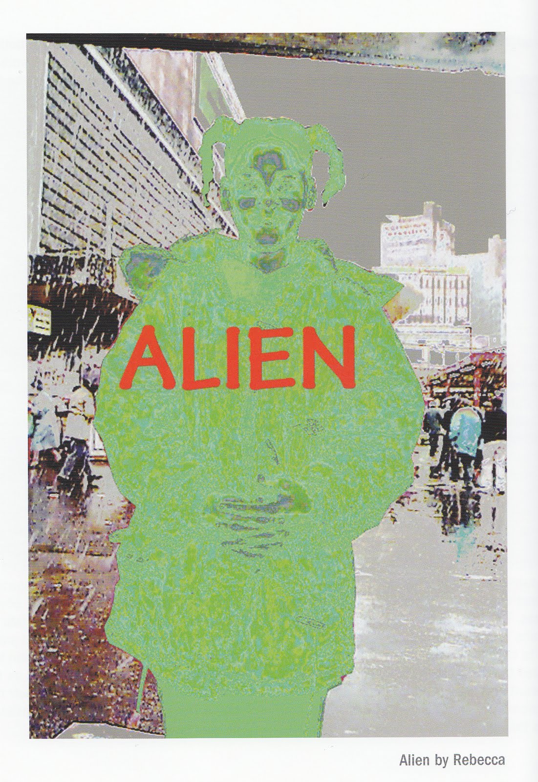
This image has been digitally enhanced. Rebecca named the image ‘Alien’. She modifies herself using Photo shop software to suggest being an alien in a busy landscape standing uncomfortably in front of the indoor bull ring market. This raises issues of her not belonging in the environment because she is not ‘traditionally defined’ in the community, I think that is the perception she is trying to give out “culture differences”.

This image was made by Danya to be produced as a postcard. In promoting young, queer, and safe website. This image was chosen to engage with the audience to have an interest in the website, but at the same time it has ‘The sense of being forced into virtual spaces in order to remain safe’. I like the way the hand is shown because it suggests taking his/her hand.
No comments:
Post a Comment